INTRODUCTION
Problem:
In the digital age we’re consuming more media than ever before. There is currently no centralized solution available for users to log all of the books, movies, shows, and games that they enjoy.
Solution:
I designed Medio around the core idea of users being able to track different types of media all in one place. I wanted to offer them a way to create custom lists that could be shared and viewed by friends. It was important to keep the design simple and fun, so that users would look forward to maintaining their logs.
Process:
- User Research & Synthesize
- Ideation & Sketch
- Low-fidelity Wireframing
- UI Design
- High-fidelity Wireframing
- Prototype Usability Test & Synthesize
- Redesign
Tools:
- Figma
- FigJam
- Miro
- Procreate
- Invision
1. RESEARCH
1.1 Secondary Research
Although solutions to helping people keep track of the media they’ve consumed exist, the none have created a centralized place to keep track of every category
With the move toward digital media and the emerging “binging” culture, people’s media consumption is on the rise while our memories can’t keep up
Users are searching for a way to log their media consumption in a single place that is streamlined, customizable, and shareable
1.2 Screener Survey
I created a screener survey to help me pick the best candidates for interviews. I sent it out through social media and received sixteen responses.
1.3 Interviews
I used the screener survey responses to select five participants to interview. Our discussions centered around their media consumption habits, their ability to remember media, and if they’ve ever kept a log of the media they consume.
1.4 Affinity & Empathy Mapping
I created an affinity map using over sixty sticky notes based on my user interviews. The groupings created were Hobbies and Interests, Media Research, Apps Currently Using, Discussions About Media, Media Memory, and List Taking Habits.
Once my affinity map was done, I generated two empathy maps. One was based around 'The Media Mogul' - a user that regularly watches and logs all media types. The other was for 'The Casual Viewer' - a user that consumes a few types of media and has never kept a log before.
1.5 Personas
With my users more clearly defined, I created two personas based on my empathy maps. Emilia is a media connoisseur looking for a centralized option to keep her media logs up to date. Jackson is a busy husband and father looking for an easy-to-use solution to track his watch history.
1.6 Problem Statements (HMWs)
To figure out my HMWs, I looked at the wants, needs, and pain points for my potential users. From here, I generated five problem statements:
- HMW give users an easy, streamlined experience when logging media
- HMW increase user participation when creating a media log
- HMW enable users to share their media logs with others
- HMW offer users the ability to customize their data
- HMW allow users to log all types of media in a centralized location
2. IDEATION
2.1 User Stories
Using all of the information I’d gathered so far, I put myself into the shoes of my potential users to figure out the who, what, and why of their interactions with the product. I wrote nine user stories and arranged them in groups according to their priority (high/medium/low). The 'must haves' included the following:
- As a user, I want to log every type of media on one platform so that I can avoid the frustration of having multiple sites to maintain
- As a user, I want to customize the data shown on my media log so that I can create a list tailored to my needs
- As a user, I want to create a secure account so that I can store my lists and save custom settings
2.2 Site Map
I created a site map to outline the architecture for the app. This helped me to visualize how content should be arranged and what hierarchy the pages would follow.
2.3 User Flows
Next I determined three red routes for actions that users would commonly use the app for:
- Log a new movie
- Create and share a list of video games
- View TV shows watched in 2020, sorted by their ratings
Once I had my routes written out, I outlined each step a user would take to complete them in a user flow diagram. This included all screens, actions, and decisions the user would interact with.
3. DESIGN
3.1 Sketching
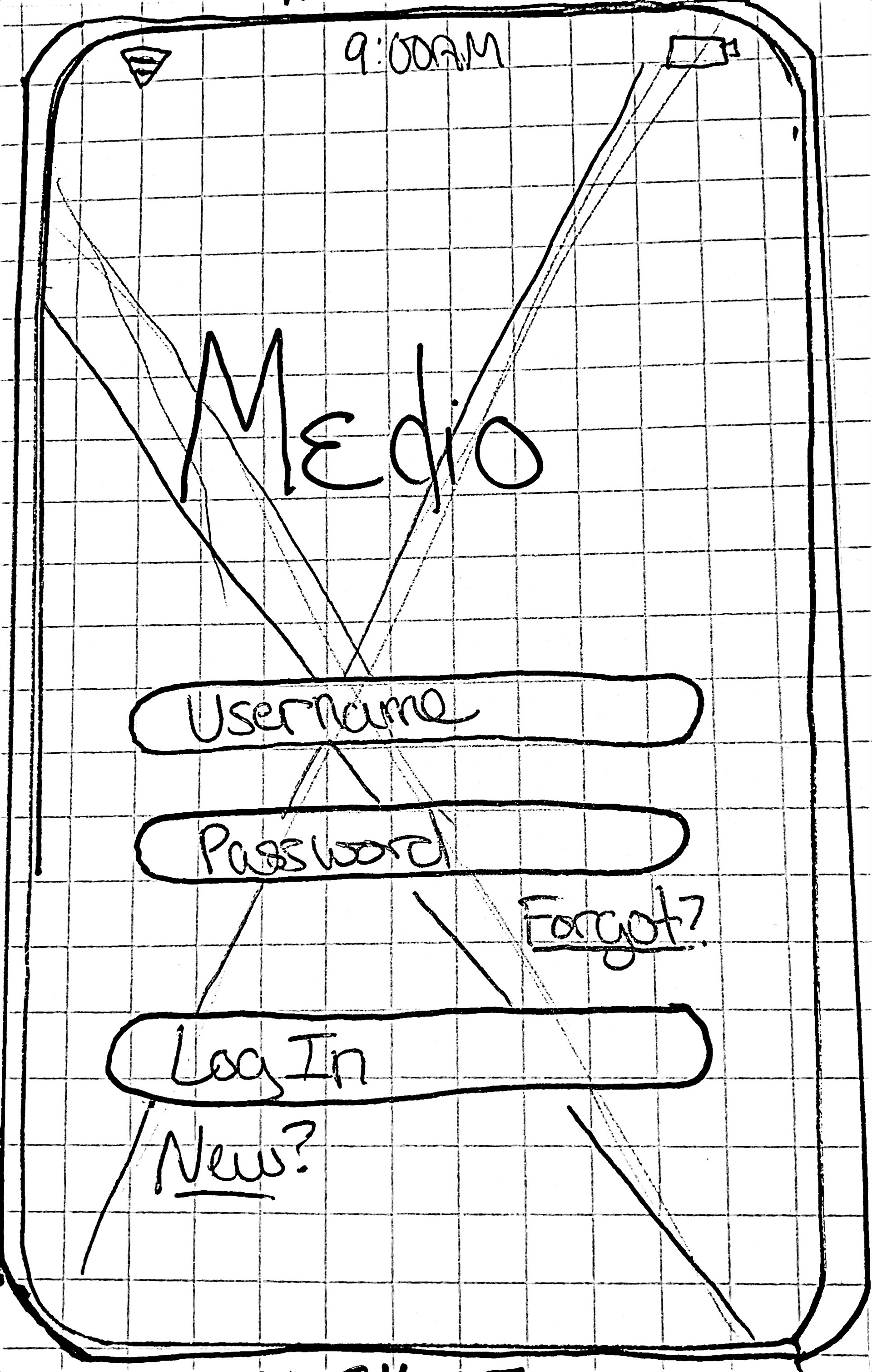
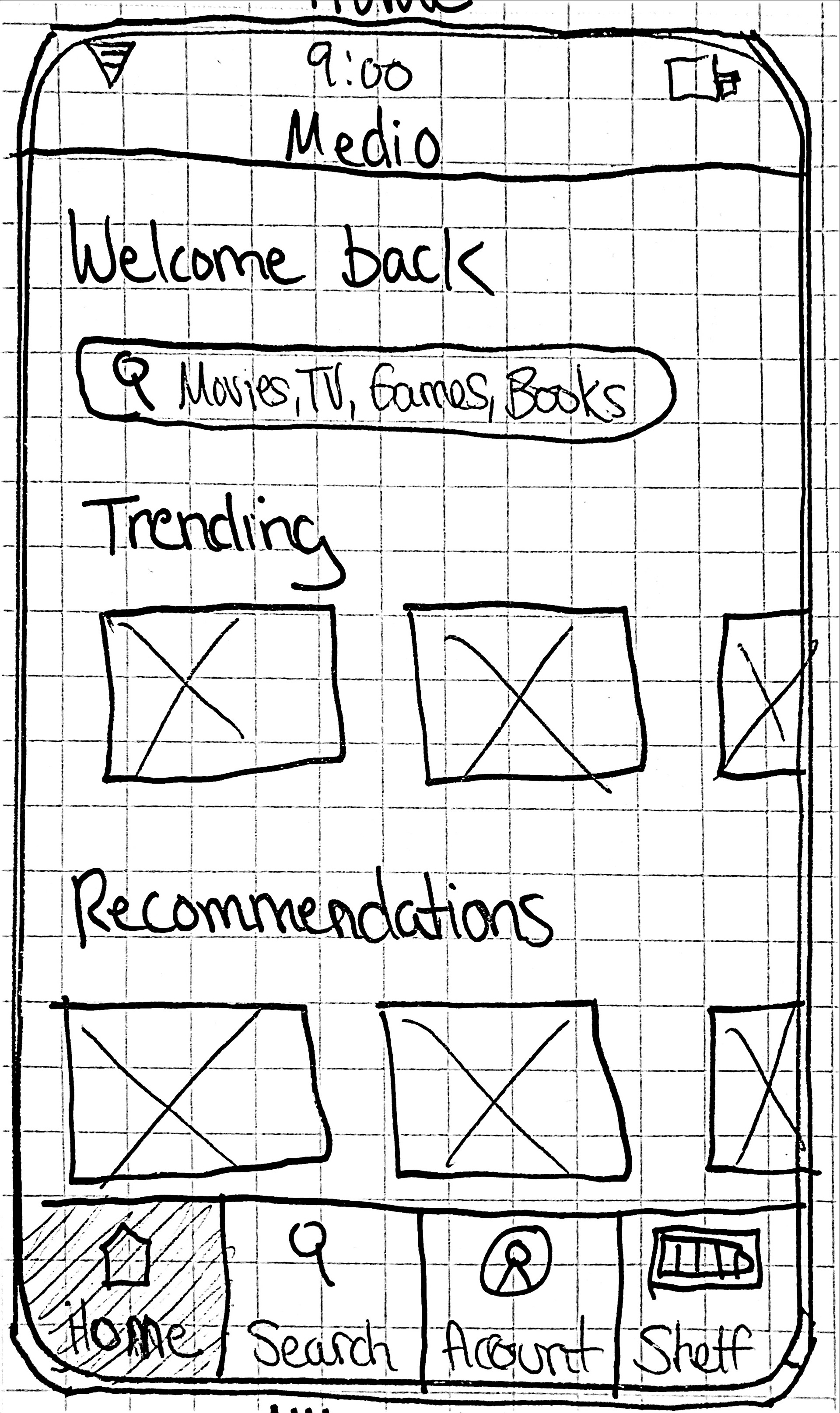
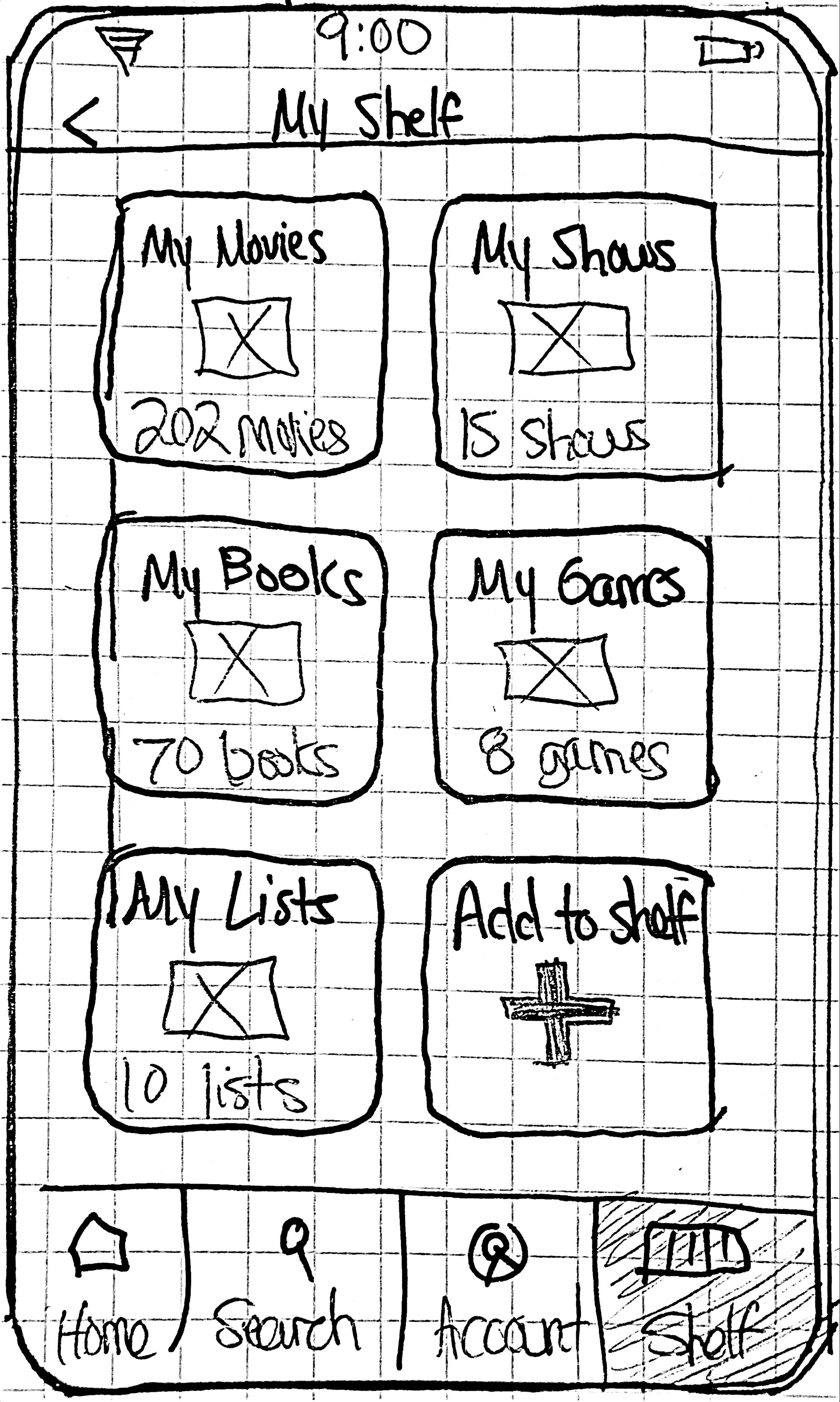
Now that I had each step included in the red routes, I could begin sketching the screens. This is where the design truly started to take form and decisions had to be made about the finer details that would make for a good user experience.

3.2 Low Fidelity Wireframes
With my sketches completed, I could now turn them into wireframes. I worked in Figma to convert all of my red route screens into wireframes. They went through several revisions before reaching a finished product that could be successfully used to build high fidelity screens from.
3.3 Brand Platform
I then created a brand platform document which outlined the name of the app, the mission/vision, as well as the brand personality and attributes. I chose Medio as the name for the app - I wanted something related to the word media that would also be short and easy to remember.
Brand attributes:
- Exciting
- Entertaining
- Reflective
- Thoughtful
- Habitual
3.4 Mood Board
To help flesh out the branding, I created a mood board which highlighted some imagery, similar app designs, as well as the color palette. Reasoning was provided for the imagery inspiration as well as the UI inspiration. I included the attributes and personality from the brand platform document.
3.5 Style Guide
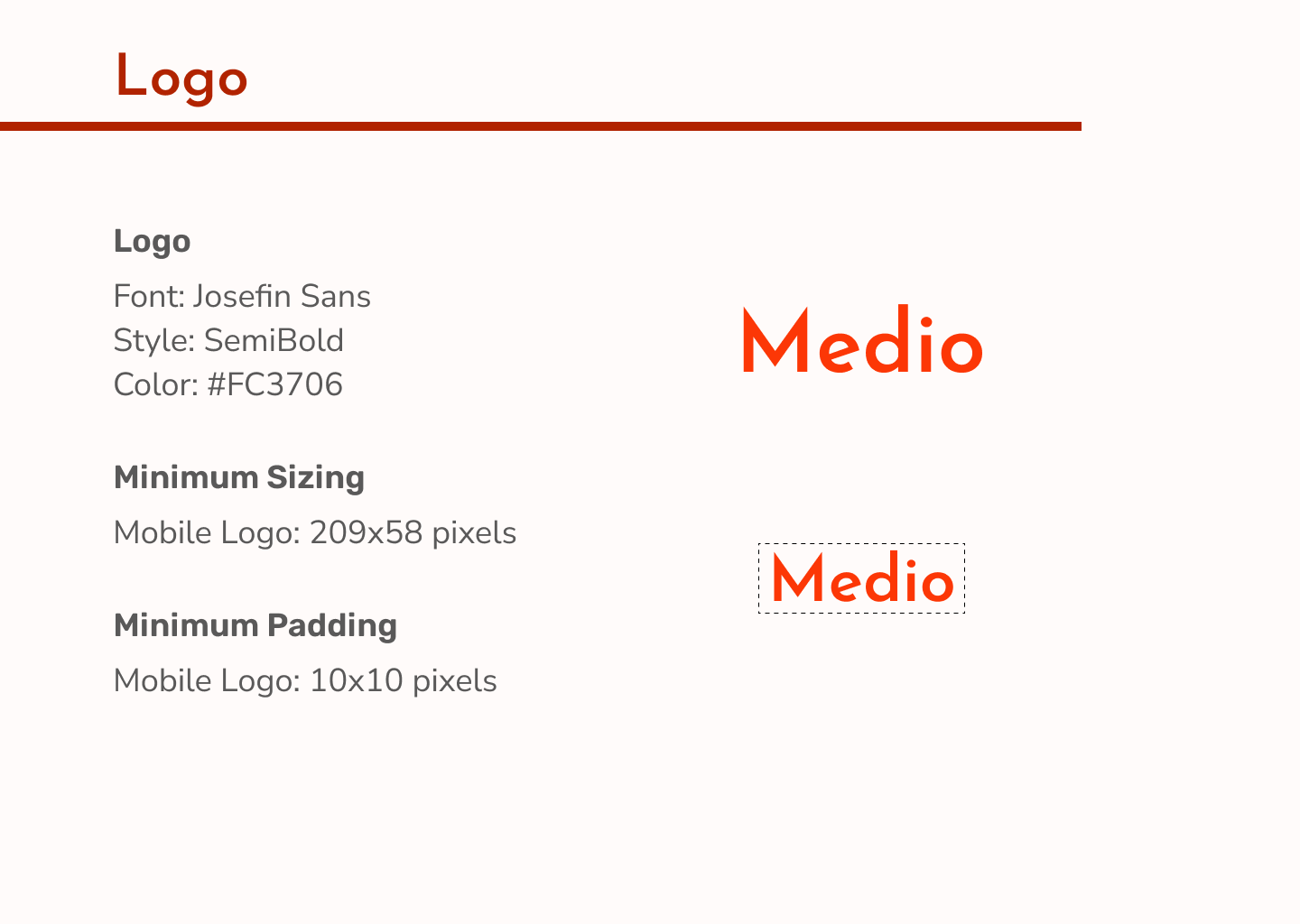
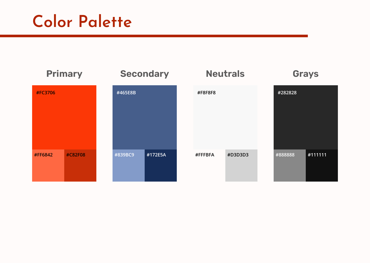
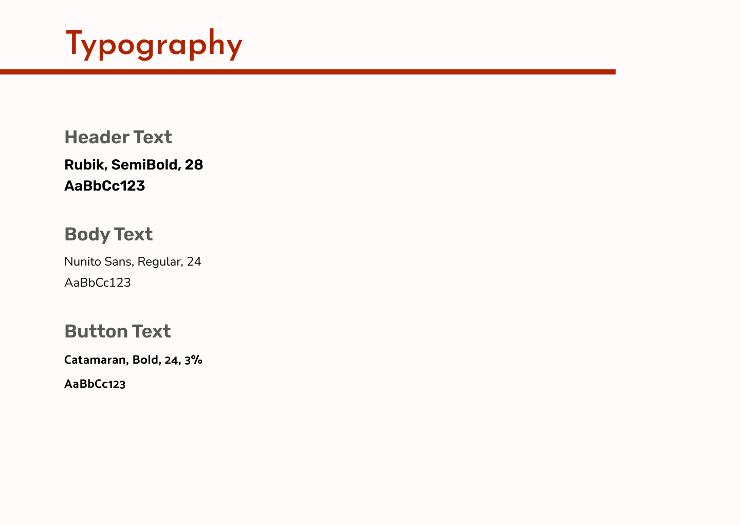
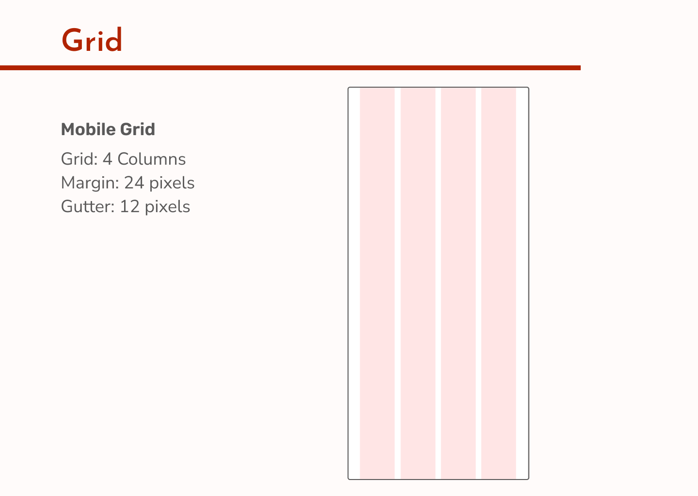
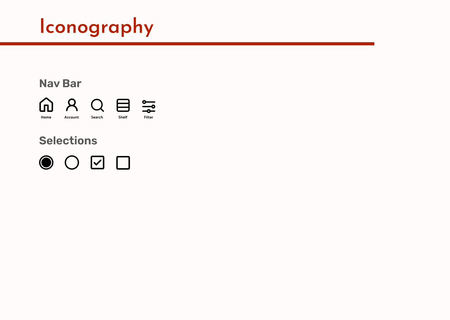
Now that I had a clear vision of the branding, I made a style guide. The style guide outlines the core aspects of Medio’s branding. This included logo specifications, color palette, typography details, grid specifications, and iconography examples.
3.6 High Fidelity Wireframes
With my style guide in hand, I began working on creating high fidelity screens from my wireframes in Figma. They went through several revisions as I identified ways to improve the usability. Once all of my screens were finished, I grouped them by their red routes for easy visualization.
Log a New Movie
Create and Share a List
Filter and Sort Watched Shows
4. TEST
4.1 Prototype
Now that my high fidelity screens were completed, I used InVision to create a clickable prototype of Medio. With this prototype I could test my user flows and identify any issues I had missed.
4.2 Usability Testing
Next I conducted five moderated usability tests using the prototype. First, I wrote a test plan which outlined my objectives, tasks, method, participant characteristics, recruitment, and schedule. Once this was completed I wrote a test script that would help me to introduce and guide each user through the test. Finally, I conducted all five tests either virtually or in person, and took notes during and after the sessions.
My main objectives during the testing were as follows:
- Understand potential usability issues
- Uncover any missing steps in red routes
- Get feedback on visual design
- Learn overall impressions of using the app
4.3 Test Results
Once testing had concluded, I organized all of the notes I had taken and used them to create a test report. The report summarized issues that were found during testing and provided recommendations on how to fix them. I also included a chart that outlined the issues by their priority ranking.
5. REDESIGN
5.1 Redesign of High Fidelity Wireframes
I used the report to edit my high fidelity screens and fix the issues that were discovered during testing. I then uploaded the revamped screens to InVision to create the final version of my prototype.
5.2 Reflection
This project helped me to realize areas where I’m strong, as well as those that need improvement. I really enjoyed the user testing segments as it gave me new insights I likely wouldn’t have thought of on my own. It was a great experience watching my project come to life, all the way from rough sketches to a high fidelity working prototype.
